
APIDA Arts Festival
Branding, building, designing, testing, and launching the website for the largest festival of APIDA* artists in Chicago.
*APIDA: Asian, Pacific Island, and Desi/South Asian American
My Roles
UX/UI Designer
UX Researcher
Art Director
Information Architect
Squarespace Developer
Content Editor
Webmaster
Methodology
Stakeholder Review
Expert Reviews
Usability Testing
Data Synthesis
Comparative Analysis
User-friendly Branding
Findings & Recommendations Report
Design Iterations
Problem
2023 was the inaugural year for the APIDA Arts (Asian, Pacific Island, and Desi/South Asian American) Festival, the largest festival of its kind in Chicago. After all the arts and performance restrictions during the COVID pandemic, the passion of the APIDA community came together to celebrate arts for a 3-day community festival. There was already an impressive lineup of popular artists, performers, and enthusiastic support from renowned Chicago theaters and media rolling in. The website would be a vital component for first-time audiences to the APIDA Arts organization, its mission, the festival’s scope, and the logistics for navigating all the events and artists. I was brought on to troubleshoot the usability issues and brand consistency of the website. Eventually, I became the webmaster of their Squarespace site which would be a vital guide and digital program for the immense lineup and complex needs. I created design solutions to resolve problems on the existing site and in anticipation of problems from a multitude of angles for the maiden voyage of the festival.
Approach
Due to time constraints, strategically maximize efficient user research strategy for the discovery phase
Incorporate festival/event experts and APIDA Arts and partner knowledge into user research
Create tantalizing and polished branding/design to raise organizational and website clout for this ambitious first-time festival
Test and iterate design solutions to minimize possible confusion and usability issues for unfamiliar audiences
Assure that the website is mobile friendly as most audience members will use the site this way to navigate the festival on location
Help Apida Arts begin its organizational journey with a thoughtful site that could serve its needs in years to come
Maximizing usability participant testing of existing site
Think-Aloud testing of both experts and potential audiences
My selection of users for testing would be strategic on two levels. In addition to users who fit the stakeholder’s profile of potential audiences for the festival, I also tested festival/event experts with experience creating cultural/arts events of similar scope. Think-aloud testing allowed me to uncover richer and more comprehensive responses from participants. Thorough user testing in advance would assure fewer problems as soon as possible and during the festival.
Usability testing goals
To understand how users (artists, donors, audiences) would use the website
To find out which elements or aspects of the site were most important to users
To gain insight into the pain points encountered by audiences
Identify opportunities to improve the usability of the platform for potential festival audiences
Findings & recommendations concerning usability
Key Findings
The Program page was the most important part of the website for all user test participants
Users felt this was difficult to scan and navigate
Large walls of text throughout the entire site were consistently overwhelming
The mobile view was especially difficult to digest
Visual hierarchy is needed to make the text more scannable
Some navigation headers confused users
Video: This is where the festival would be live-streamed
Users thought these were artist videos
Donate: This would also include volunteering and partnering
Users were unable to find additional info about volunteering in existing menu
Directory: This would be a living APIDA Artist Directory that is unrelated to the festival
Users were confused thinking this was the schedule or program for the festival
Audiences were very excited about the festival overall
Despite usability issues, users were able to get the information needed to decide to go
“So cool to know this kind of thing is happening in Chicago!”
— User testing college student, arts enthusiast
Comparative analysis & inspiration from a music festival
I looked into theater and arts organization websites to find ways to present and promote events, logistics, artists, and schedules. However, I could not find examples with the broad range of types of artists and schedules that were useful. The most useful site I came across was a music festival site called Big Turn in a small Minnesota river city. I found a few parallels here.
Tantalizing yet simple language promoting the 2-day festival details immediately upon arrival on the homepage
A large variety of lineups and music types
Elegant, user-friendly categories to navigate the site and learn about the festival


Branding the Apida Arts Festival and the website for success
Looks matter, especially for an arts festival. One of the first things users commented on was the style of the site overall. They felt that it could be a site for anything and not necessarily an arts festival.
With a background in visual design, it was clear that the site needed a lot more work on visual branding. Before digging into any design solutions for the website I created much-needed branding options and a style guide around their existing bird icon and the general logo they had begun to use. I created a style guide that would provide
Brand consistency
Logo variations for additional uses
Colors, fonts, and style elements
Professional polish and legitimacy for an entirely new festival that had never existed in Chicago until now
Plus additional spot illustrations that would add playful and creative elements to appeal to family target audiences and the artist in us all.

Recommendations: Branded wireframe solutions
In my recommendations, I included annotated newly designed wireframes that addressed the usability issues with proposed design solutions throughout.


The Program page and Squarespace limitations
The existing program page was overwhelming and difficult to navigate.
Squarespace is a platform that is easy to use but limited in more varied customization. Creating wireframes for the complicated Program page would be redundant if it wouldn’t work on the Squarespace platform. Therefore, I created test pages for the Program directly in Squarespace, leaving them unpublished until they were approved.
The information on these pages was extremely complex and needed to fulfill a variety of non-negotiable needs and agreements from artists, venues, and APIDA Arts staff as well.
High-profile Chicago theaters with different needs
Three separate days of original arts/performance programs
A large variety of Art mediums
Grafitti, puppetry, cooking, crafts, historic walking tours, dance, storytelling, stand-up, and many more
A wide range of artist numbers
Solo acts, entire troupes, dancers, directors, flashmob, writers, the list goes on
with each promised a custom description
Crediting and celebrating the incredible generosity of everyone involved (from staff to venues) could at times overwhelm the most important information navigating the festival
Iterating to prioritizing website needs and solutions
During ongoing tests of approved wireframes, I found that users were confused about these aspects of the festival. I would need to come up with a variety of ways to quickly make these important details clear and scannable to website audiences.
The APIDA Arts Festival is a FREE Festival
However, the highly publicized After-Party is a PAID event
The Festival is a three-day event, in four different locations, with three different lineups
Content editing combined with design for clarity
I combined my skills in promotional content editing and design hierarchy to clearly and efficiently convey the vital yet potentially confusing aspects of the FREE 3-day festival and paid After-Party details to new audiences.
Substantially reduced the amount of text for scannability
Implemented marketing best practices including
Promotional language
Calls to action
Bulleted lists
Simple and clear wording for headers and buttons
Used a combination of several design principles including
Hierarchy • Color • Spacing • Size • Positioning
Seen here on
The Homepage
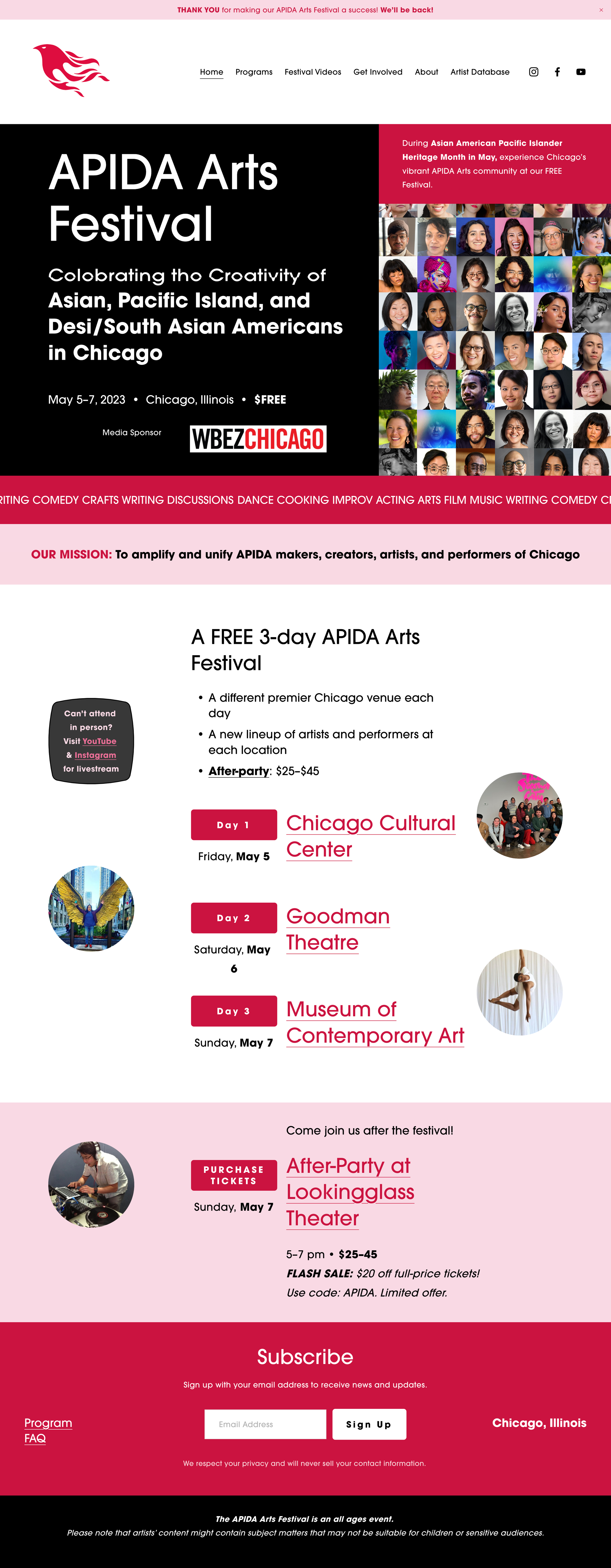
Detail from the Homepage

Also seen here
On the top of a Program page

Detail from a Program page

“What the festival is and how it happens is much clearer. WOW, everything is so much easier to read and understand!
— User testing participant, art museum event expert
“It’s like a different site, it’s so professional!”
— User testing participant, APIDA Arts staff member
Final designs and festival success
In user testing of the final design iterations, I went back to the festival experts that I tested in the beginning. They were each impressed and excited by the changes. After the festival ended during a final meeting with all the artists, partners, and representatives from the four renowned theater venues in Chicago that served as the sites for all the events, all the representatives were happy with the site and the online program for the events of their locations. We collected comments that help guide APIDA Arts for next year. Overall, the inaugural website I created for this exciting and ambitious new festival did its job well, I’m so proud that I was able to raise the profile of this incredible APIDA Arts community.
A Sampling of Final Pages from the Festival
Homepage

Day 1 Program

Get Involved

Artist Database

“You did a fantastic job on the website and are one of the 7 people who made this festival happen.”
— Mia Park, APIDA Arts Festival, Executive Director
Outcomes & Lessons
I prioritized the issues that were absolutely necessary that could make or break the festival. With this being the first year ever it was vital to start with branding that would excite audiences and create memorable UI design and visual branding for the site. Good design engages and connects with audiences. I also focused on the basic logistics of the festival and was certain the program schedule would be clear to navigate audiences through the entire festival. Next year we already have plans to move the site to WordPress in order to improve the virtual Program pages and artist listings. Things happened so quickly. With more time being able to focus more on the page which serves as the living APIDA Artists Directory and also improve consistency in content editing and wording would improve the site and festival greatly.
What I Learned
Passion can propel an organization against the odds. This first-time festival was featured all over the Chicago news. And despite many challenges, it left an impact and inspired the APIDA artist community and its allies in the Chicago area. The mission to celebrate and showcase APIDA Artists in Chicago after COVID as a community was the fuel that kept us going.