
Vertical Endeavors Website
Usability findings and recommendations for the premier climbing facility in the Minneapolis metro area
Methodology
Usability Review
Usability Testing
Data Synthesis
Findings & Recommendations Report
My Roles
UX Designer
UX Researcher
Testing Notetaker
Overview
Vertical Endeavors is the premiere climbing facility in the Minneapolis area and a trusted resource for the climbing community year-round. They cater to all levels of climbing activity from advanced mountaineers to children at parties. Their reputation is widely known and they are beloved by climbing enthusiasts. Our UX Design team evaluated and provided recommendations to their website, the digital gateway to all they offer for their loyal fanbase and potential climbers as well.
Conclusion
Vertical Endeavors’ trusted reputation keeps their customer base pressing on through frustration on their website. With just a few changes their website would be on par with their second to none climbing offerings and knowledge, allowing them to grow their business and community to the highest heights.
“Impressive that they have so much happening post COVID. I'd love to know more, but the site is confusing.”
— Quote from research participant
Usability Review
Heuristic Analysis
Our team of UX Designers used pre-defined criteria to our advantage and quickly evaluate Vertical Endeavor’s website’ usability. We shared our heuristic hypotheses and then came up with a usability test plan using the collected insights. Our collected findings begin to reveal themes that became more clear throughout our evaluation process.
Usability Testing
Think Aloud Testing
We carried out remote usability testing with seven selected participants including long-time devoted customers, climbing enthusiasts, climbing-interested audiences, and parents/caretakers looking to engage youth. Participants were asked to think out loud as they navigated through Vertical Endeavor’s website in order for our team to “come with them” on their journey through the site. They gave us their overall impressions of the site and functionality as our team moderator gave them tasks to complete.

Remote usability testing with participant #2

Affinity Diagrams.
Raw data was collected during usability testing with our participants. We put the insights and data into an affinity diagram to find patterns and insights. Standout patterns emerged:
The homepage lacked focus and clarity
Categories throughout the site confused users
Large amounts of text were overwhelming
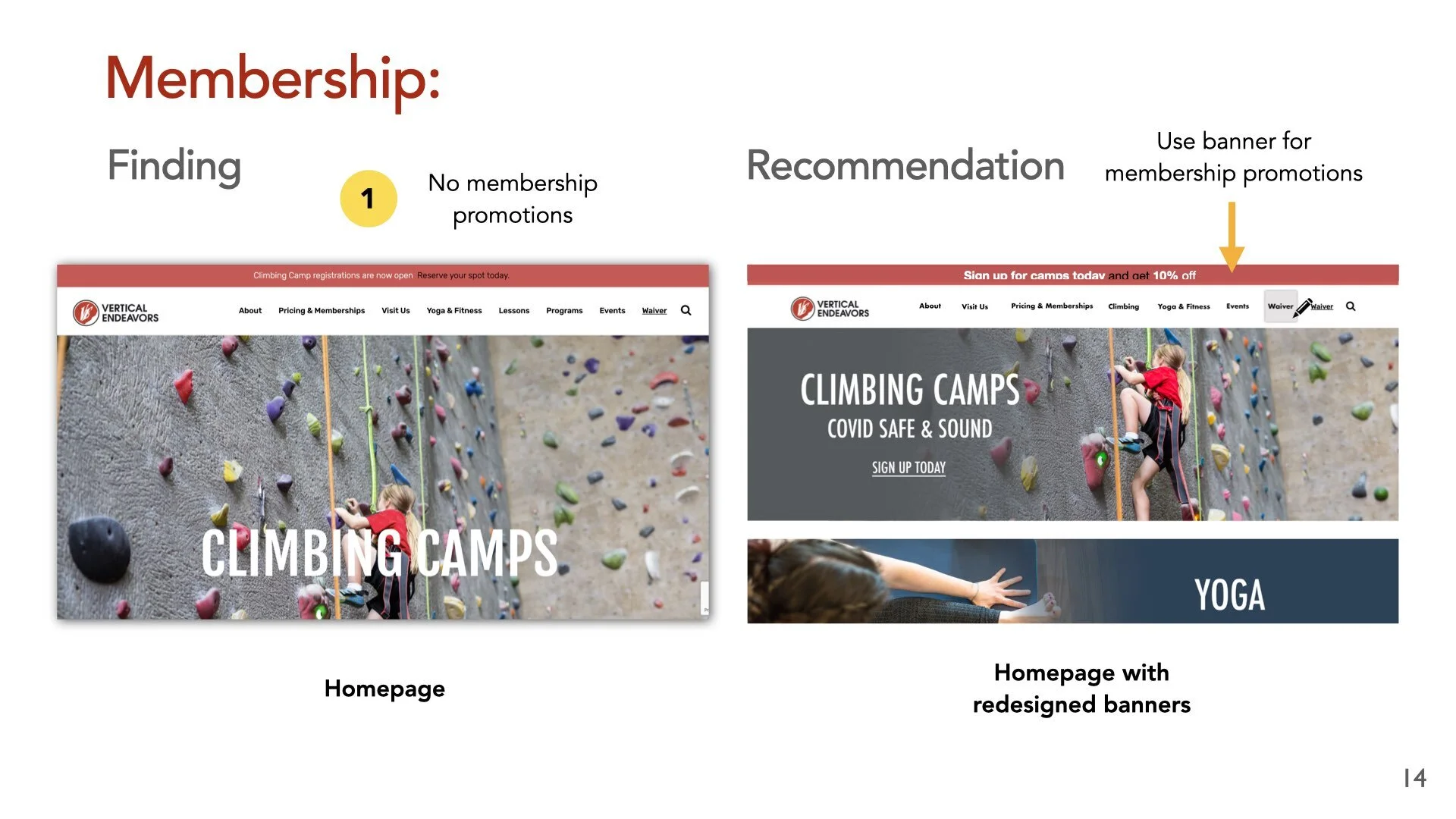
Memberships and payment levels were unclear without clear hierarchy

Section from affinity diagram
Quotes from research participants
“There's so much copy. I'm trying to read it but not absorbing any of it… Things have equal weight but have different information.”
“Based off of this, I'd have to make a phone call. I probably wouldn't follow through. I'd probably find somewhere else."
Findings & Recommendations Report
We collected our findings and included recommendations as well. The report focused on two highly problematic areas: where solutions would have the biggest impact on web audiences.
The Homepage
Memberships and pricing


“Climbing culture is a thing, it's not integrated into this site very well…Everyone has different ideas of what this climbing gym is for. It isn't meeting those audience members whether they’re regular climbers or not.”
— Quote from research participant
Outcomes & Lessons
The multitude of offerings and Virtual Endeavor’s climbing expertise is undisputed. However, the dizzying array of programs and classes on the website easily overwhelms even the most seasoned Vertical Endeavors visitor. With more focused intuitive categories and predictable patterns of interaction, the site can create more efficient and positive online experiences for this enthusiastic community. Their eager fanbase is unable to engage online with Virtual Endeavors without issue. With just a few changes, the web platform can compliment and expand the exciting possibilities for audiences long before they arrive on site.
What I Learned
A frustrating online experience can sour even the most dedicated and loyal fans. Even though genuine passion for the community might keep them interested, inconveniences or confusion may cause potential new fans to turn away. Putting care into improving the experience can impact the current community as well as those to come.